Website upgrading - inject fun!
Posted 04 Jun 2015
I seem to have been upgrading the Bible Cartoons website for ages… no, wait, I HAVE been ages doing that! Well, not “ages” but 5 weeks – eek! How the time flies.
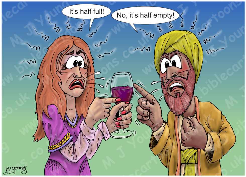
It is so easy to concentrate on what has not worked, rather than what has worked. Does that make me a “glass half empty” kind of a guy – guess so!

But there have indeed been successful improvements made:
01) I replaced the image-based menubar with a purely CSS coded one.
I hope that will speed up the page load times. It’s quite colourful really, which is nice! I use coloyers to define the area the customer is viewing, eg orange is anything Bible Cartoons related, whilst light blue is the Contact section, etc.
02) I managed to find a way to insert a “footer”. These are notorious for NOT remaining at the base of a page, & tend to creep up & overtake page content! I managed to find a way to keep the footer down at the foot of the page!
03) I re-vitilised what I call the “Hub & News” page. It now resides under the “Home” button on the new menubar. It contains all the latest things that are happening in my little world of Bible Cartoons!
04) I have simplified page layout, taking out the various columns & making the website page contents fit the whole width of the page.
I have removed the sidebar, in line with this new, simpler design. Links can be found on the footer now.
05) I have re-vamped the landing page, including removing the slideshow that ran there recently. It was a nice feature, randomly showing 10 Bible Cartoons. That feature seemed to be slowing down the page… & we can’t have that!

Improvements still to do.
01) Convert image-based buttons to CSS-based ones.
This is a slow process, as I have a lot of image-bassed buttons that do various things on the website! But I’m getting there.
02) I use various plug-ins on this website, I will endeavour to remove them, where possible, to speed up the page delivery speed.
03) Add a Breadcrumb bar under the menubar, to aid navigation.
This is proving to be very problematic to implement, but I hope to get it working very soon.
04) Re-vamp the Gallery pages (where you see the Bible Cartoons). I’ve started this, the page looks better already, but there is more to do.
05) Re-vamp the shopping cart.
This involves adding an Order Confirmation page, so customers can more easily see what they’ve ordered & make amendments, if necessary.
The upgrade has these global aims:
01) To make the BC website fully mobile-friendly.
02) To optimise page design for tablets.
03) To simplify page design, to speed up page download times.
04) To inject fun into the website page designs.
I’ve been reading Terry Pratchett’s “Raising Steam” novel recently, & that reminds me that I want to have FUN in life! And I want to have fun show up on the website. To that end I want to insert little cartoon characters in unexpected places throughout the pages.
There’s also a great map inside “Raising Steam”, which reminded me to have fun with my own maps – I can get far too serious about Bible Cartoons, so “Raising Steam” has been a great reminder for me to HAVE FUN!

Follow this link to see Bible Cartoon maps, with download & purchase options:
View all Bible Maps
Comments
Comments are turned off for this article
Go to Blog Archive page
