Bible Cartoons Shopping cart improvements
Posted 28 Sep 2017

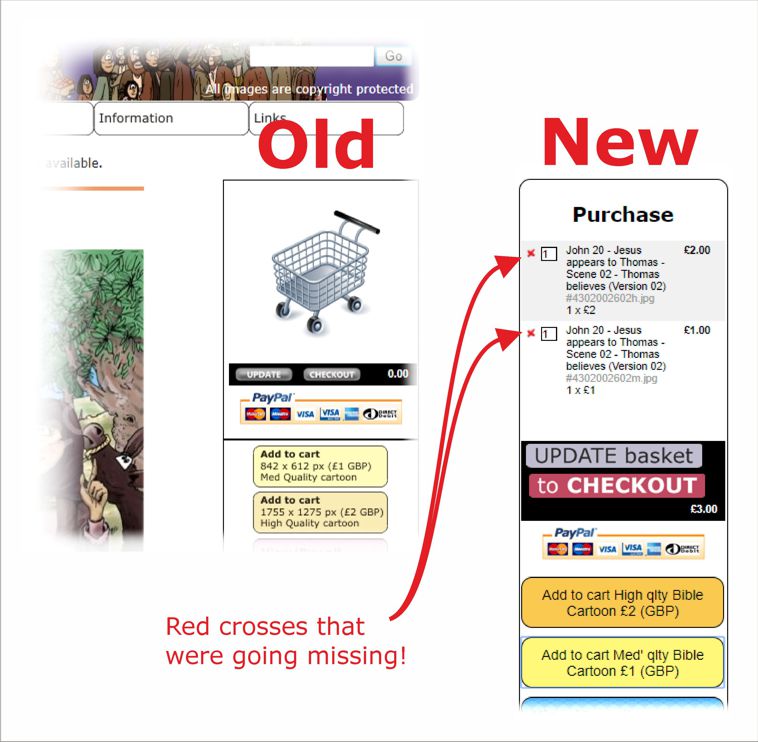
Old and New shopping carts
I have changed the embedded shopping cart on the Bible Cartoons website. In the “Old” version (see picture above) the update and checkout buttons were small, as supplied from the manufacturer of the program. Having read a bit more about customer engagement and trying to make it as easy as possible for customers to use your website, it became apparent that these buttons were far too small, especially when viewed on a mobile phone! So I have replaced these buttons with larger, more colourful versions (see “New” version in picture above).
I also noticed that the little red delete crosses, to the left of items loaded into the shopping cart, were missing when a customer loaded a few items. After some investigation I realised this was because the shopping cart was not wide enough to accommodate the vertical slide bar and the red crosses, once more items were loaded into the cart than the cart window could display, in 1 screen. A quick widening of the CSS that controls the cart window solved that issue… admittedly that lead to several hours of head scratching and minor tweeks to the rest of the pages CSS, to keep it all running smoothly as a responsive design! Oh well, it was worth it to increase customer happiness and experience!
I hope these changes will help to make the shopping process on the BC website an easier, nicer experience for my customers.

Comments
Comments are turned off for this article
Go to Blog Archive page
